Navigation
Setting up the navigation menu is very easy in the NCAMEO application. Just follow the steps below:
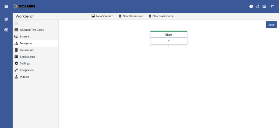
Click on the “Plus” Sign on Start tab. As shown in the below image. A Form will open in the sidebar where you can configure and set up pages in the application.
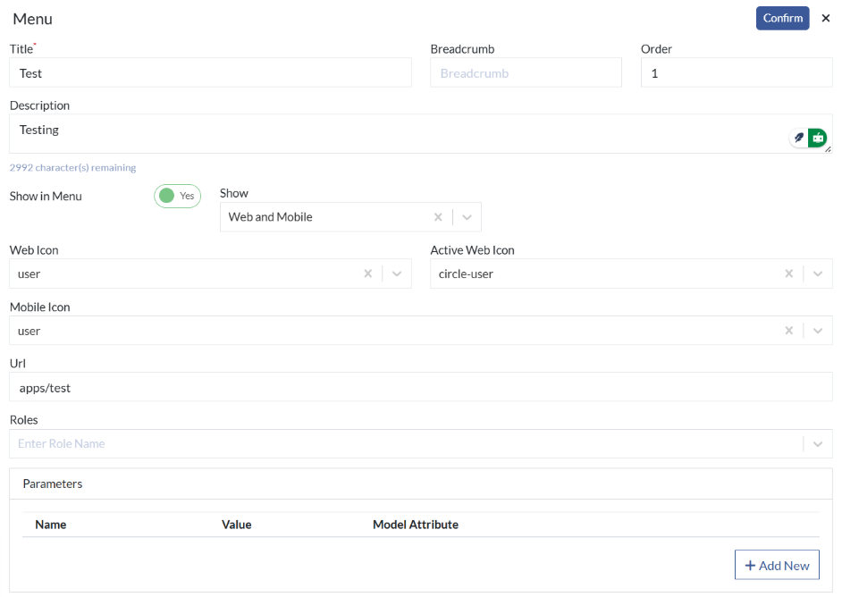
- Title: The display name of the page or route shown in the browser or app.
- Breadcrumb: A label used in breadcrumb navigation to represent the current page location.
- Order: Defines the sequence in which this page appears in the navigation menu.
- Description: A brief summary or purpose of the page or route.
- Show in Menu: Determines whether the page should be listed in the main navigation menu.
- Show: Controls the visibility of the page or component in the application.
- Web Icon: The icon displayed for this page in the web interface.
- Active Web Icon: The icon shown when this page is currently active or selected in the web interface.
- Mobile Icon: The icon displayed for this page in the mobile version of the application.
- Url: The path or endpoint used to navigate to this page.
- Roles: User roles allowed to access or view this page.
- Parameters: URL parameters passed to this page for dynamic behavior or data.
- Name: The key name for a parameter or model attribute used in this page.
- Value: The value assigned to the corresponding parameter or field.
- Model Attribute: A linked model field used to bind data dynamically on the page.
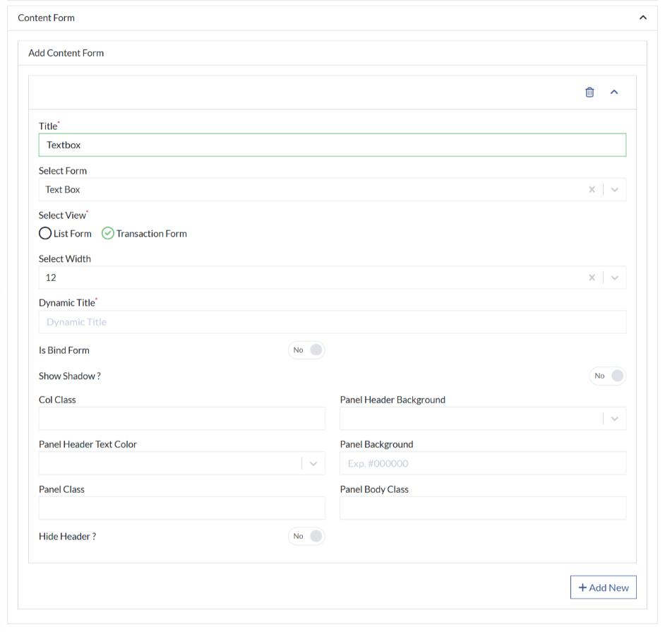
Now you can start adding content form on the page.
- Title: The title displayed at the top of the panel or component.
- Select Form: Choose a form to embed or display within the panel.
- Select View: Select a view layout or component to render inside the panel.
- Select Width: Defines the width of the panel (e.g., full, half, custom width).
- Dynamic Title: Enables the title to change dynamically based on data or state.
- Is Bind Form: Indicates whether the panel is bound to a form for data interaction.
- Show Shadow?: Toggles a drop shadow effect around the panel for visual depth.
- Col Class: CSS grid or column class to control panel width and responsiveness.
- Panel Header Background: Sets the background color of the panel's header section.
- Panel Header Text Color: Defines the color of text in the panel header.
- Panel Background: Specifies the background color of the entire panel.
- Panel Class: CSS class for styling the outer panel container.
- Panel Body Class: CSS class used to customize the panel's content area.
- Hide Header?: Option to hide the panel’s header section for a cleaner look.
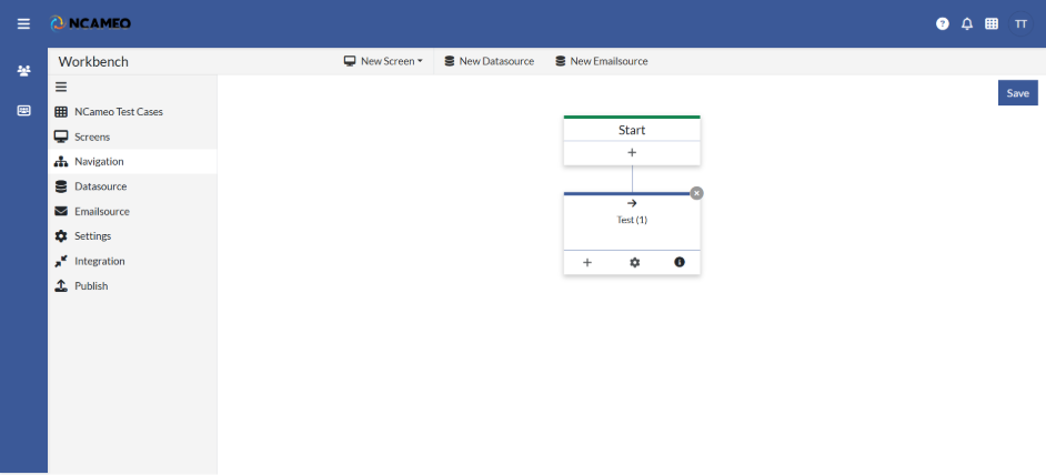
Click Confirm and item is added to the navigation as shown in the image below: