Theme
There are multiple themes available for you to choose from in NCAMEO. These themes help you design the UI of the pages in the application for example the button, text, etc. Colors can be changed based on the theme select by you.
We can choose from Default, Signal, Greyson, Fresca, Darkster, Hello Kiddie or Custom as shown below. In custom you can define your own theme by adding Color codes.
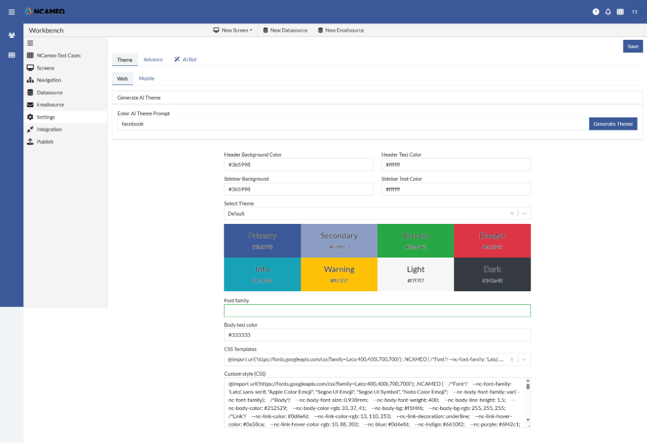
- Web
- Generate AI Theme: Automatically creates a visual theme using AI based on the given prompt.
- Enter AI Theme Prompt: A descriptive input that guides the AI in generating a matching theme style.
- Header Background Color: Sets the background color of the application's header section.
- Header Text Color: Defines the text color used in the header area.
- Sidebar Background Color: Specifies the background color for the sidebar panel.
- Sidebar Text Color: Determines the color of the text displayed in the sidebar.
- Select Theme: Allows choosing from predefined theme styles for quick styling.
- Font family: Sets the font style used throughout the application.
- Body text color: Controls the default text color for the main content/body area.
- CSS Templates: Offers ready-made CSS designs that can be applied to the app.
- Custom style (CSS): Enables entering custom CSS code for complete style customization.
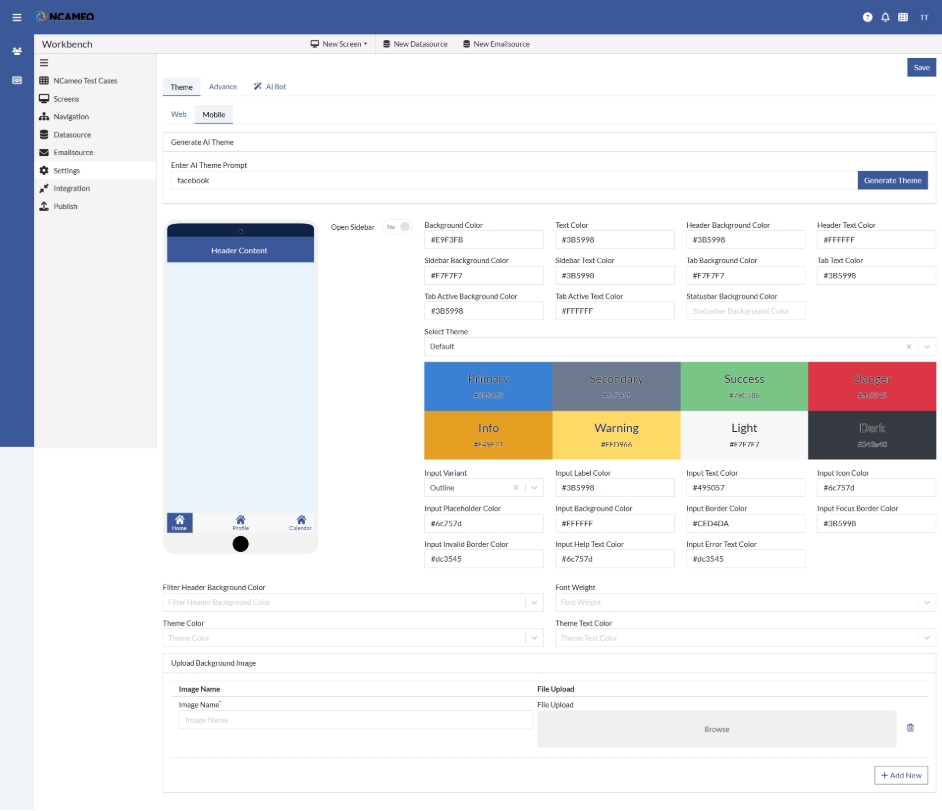
- Mobile
- Generate AI Theme: Automatically creates a visual theme using AI based on the given prompt.
- Enter AI Theme Prompt: A descriptive input that guides the AI in generating a matching theme style.
- Background Color: Sets the overall background color of the application or component.
- Text Color: Defines the default color for text across the interface.
- Header Background Color: Sets the background color of the application's header section.
- Header Text Color: Defines the text color used in the header area.
- Sidebar Background Color: Specifies the background color for the sidebar panel.
- Sidebar Text Color: Determines the color of the text displayed in the sidebar.
- Tab Background Color: Specifies the background color of inactive tabs.
- Tab Text Color: Color used for text in inactive tabs.
- Tab Active Background Color: Background color for the currently active tab.
- Tab Active Text Color: Text color for the active tab label.
- Statusbar Background Color: Background color of the status bar (typically at the top of mobile apps or sections).
- Select Theme: Allows selection of a predefined visual theme for the UI.
- Input Variant: Chooses the style variant for input fields (e.g., outlined, filled, underlined).
- Input Label Color: Sets the color of labels attached to input fields.
- Input Text Color: Defines the color of text entered into input fields.
- Input Icon Color: Sets the color of icons within or next to input fields.
- Input Placeholder Color: Color of placeholder text inside input fields.
- Input Background Color: Background color of input fields.
- Input Border Color: Border color for input fields in normal state.
- Input Focus Border Color: Border color when an input field is focused or active.
- Input Invalid Border Color: Border color shown when an input contains invalid or error data.
- Input Help Text Color: Color for helper/instructional text below input fields.
- Input Error Text Color: Color of error messages related to input validation.
- Filter Header Background Color: Background color of the filter section header.
- Font Weight: Sets the thickness or boldness of text (e.g., normal, bold, light).
- Theme Color: The primary color used throughout the app for branding and highlights.
- Theme Text Color: Text color used for elements styled with the primary theme color.
- Upload Background Image: Option to upload a background image for the UI or section.